CI & Slogan
CI Story

Intelligent Sensor Technology
i-SENS is a pioneering company working in the next-generation bio-industry that provides customers with healthier lives through wide-ranging insight that helps us comprehend the future and intelligence that enables us to understand the needs of the market and our customers.
Sharp
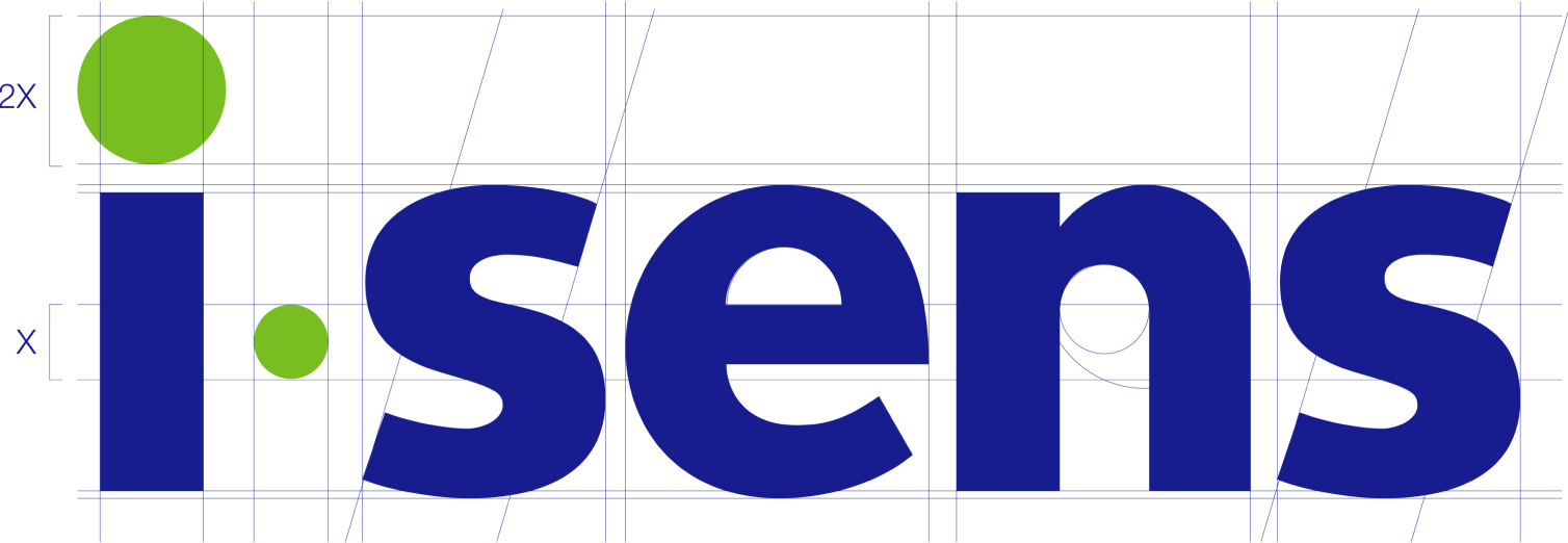
The logotype features a harmonious combination of straight lines and curves that signify technological prowess grounded in humanism, while the letter 'i' represents a new perspective (intelligent insight) and an 'eye' on customers.
Color
i-SENS Blue symbolizes our expertise and reliability, and i-SENS Green symbolizes our intelligence and sensibility.
Definition of Slogan
Sensing Ahead
We move towards a better tomorrow with advanced biosensor technologies and insight into the future.
Caring More
We think and research ahead to help our customers live healthy lives and create a healthier future.
Sensing Ahead, Caring More
This slogan encapsulates the corporate philosophy of i-SENS, which is to move towards a better tomorrow with advanced biosensor technologies and forward-thinking insight, to think and research one step ahead for the health of our customers, to create a healthier future, and to further promote human health and fulfill our responsibility as a member of society.
Wordmark
The wordmark is a specific character designed using i-SENS’ dedicated colors.
This is a representation of the our identity that best displays the characteristics and symbolism of i-SENS.
Clear Space
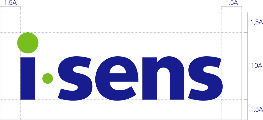
Clear Space is a guideline that ensures a minimum amount of space is maintained around our wordmark by preventing interference from other elements.
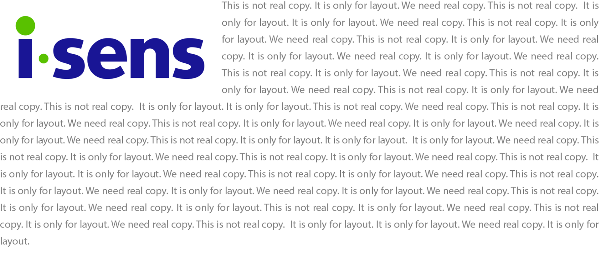
When applying the logo across various media, it is essential to maintain a minimum amount of space and avoid interference from other elements or complex patterns. Clear Space

Example

Signature
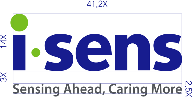
The signature is designed to harmonize with the slogan and the wordmark and must be applied in accordance with the established guidelines.
*Slogan Typeface_Myriad (Semibold)
Color_i-SENS Gray Left-aligned layout

Right-aligned layout

Bottom-aligned layout

Color Identity
These are the primary colors that represent the i-SENS corporate identity.
The corporate identity must be maintained by using the colors in compliance with the use guidelines.
In order to effectively use the dedicated colors, we advise checking the printing method, ink concentration, paper material, conditions of the application medium, and other such factors to maintain the standard colors defined in these guidelines.i-SENS Blue
#171c8f
R:23 G:28 B:143
PANTONE 2746 C
C:100 M:85 Y:0 K:0
i-SENS Green
#78BE20
R:120 G:190 B:32
PANTONE 368 C
C:54 M:0 Y:100 K:0
i-SENS Gray
#53565A
R:83 G:86 B:90
PANTONE Cool Gray 11C
C:0 M:0 Y:0 K:80